Forms
Build forms for lead capture, event registration, applications, orders, reservations, and signed agreements, with a full-screen, live visual editor. Every submission can create or update records in your CRM, take payment through Stripe, and fire automations.
Overview
Forms in Modality are more than data collectors, they are a core CRM and commerce surface. A single form can dedupe respondents into living People records, route different fields into separate custom objects, collect payment, book a reservation, capture a legally auditable signature, and hand entries off to automations and webhooks.
The Forms page lists every form in your workspace with its submission count, status (Draft or Published), and creation date. Click a form to open the full-screen builder.
The Live Form Builder
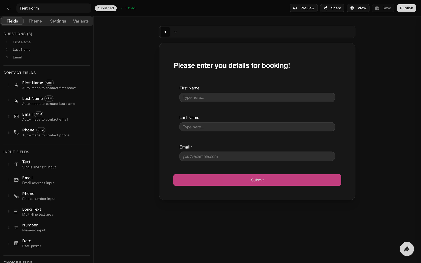
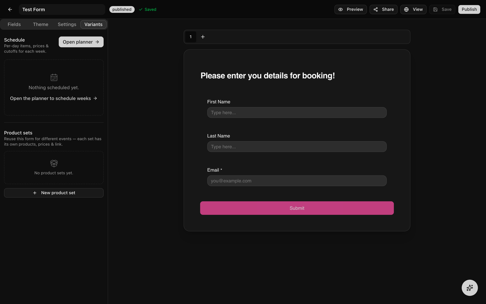
The builder opens full-screen. It is a "what you see is what you get" editor: the center canvas is the real form, and you click directly on titles, labels, helper text, and option values to edit them inline. The layout has three regions:
- Left rail, four tabs: Fields (the palette plus a numbered question outline), Theme, Settings, and Variants.
- Center canvas, the live form, with page tabs above it and a header block (cover image, title, description) at the top.
- Right panel, the Field Settings panel for whichever field (or the header) is currently selected.
How to Build a Form
- 1
Create a new form
Go to Forms in the sidebar and click "New Form." Give it a name and the full-screen builder opens immediately on a blank canvas with one page.
- 2
Add fields from the palette
On the Fields tab, click a field to append it to the current page, or drag it onto the canvas to drop it at a specific position (a blue insertion line shows where it will land). The palette is grouped into Contact Fields, Input Fields, Choice Fields, Commerce, and Layout & Other.
- 3
Edit fields inline
Click a field's label or helper text on the canvas to rename it. For choice fields, click option labels to rename them or use the "+" control to add options. Click the header area to edit the form title, description, and cover image.
- 4
Reorder by dragging
Drag any field by its grip handle to reorder it within the page. The numbered question outline in the left rail mirrors the order and lets you jump to any field.
- 5
Open Field Settings
Select a field (click it, or pick it from the outline) to open the right-hand Field Settings panel, where you set required, validation, width, placeholder, conditional visibility, and type-specific options.
GIF: dragging a field from the left palette onto the canvas, dropping it between two existing fields, then clicking its label to inline-edit the text.
Demo GIF / screenshot to be added
Screenshot: the builder toolbar showing the three save-status states side by side, 'Saving…' with spinner, 'Unsaved changes' in amber, and 'Saved' with a green check.
Demo GIF / screenshot to be added
Keyboard Shortcuts
The builder supports shortcuts for fast editing. They are ignored while you are typing in an input, so normal text editing (including native copy/paste) is never hijacked.
⌘/Ctrl + Z, undo⌘/Ctrl + Shift + Zor⌘/Ctrl + Y, redo⌘/Ctrl + C, copy the selected field⌘/Ctrl + D, duplicate the selected field in place⌘/Ctrl + V, paste the copied field after the current selectionBackspace/Delete, delete the selected fieldEscape, deselect the current field
Undo/redo history covers additions, deletions, reorders, inline label edits, setting changes, page changes, and condition edits (up to 50 steps for the builder session).
Field Types
The palette is organized into these groups:
- Contact Fields, First Name, Last Name, Email, Phone. These carry a CRM badge and are pre-mapped to the matching People columns.
- Input Fields, Text, Email, Phone, Long Text, Number, Date.
- Choice Fields, Dropdown, Checkboxes, Radio.
- Commerce, Products (priced items for checkout) and Reservation (book a bookable Space).
- Layout & Other, Signature (e-signature), Address, Image Upload (respondent uploads), Image (display-only block), Section (heading + description), Paragraph (display text), and Hidden.
Field Settings & Validation
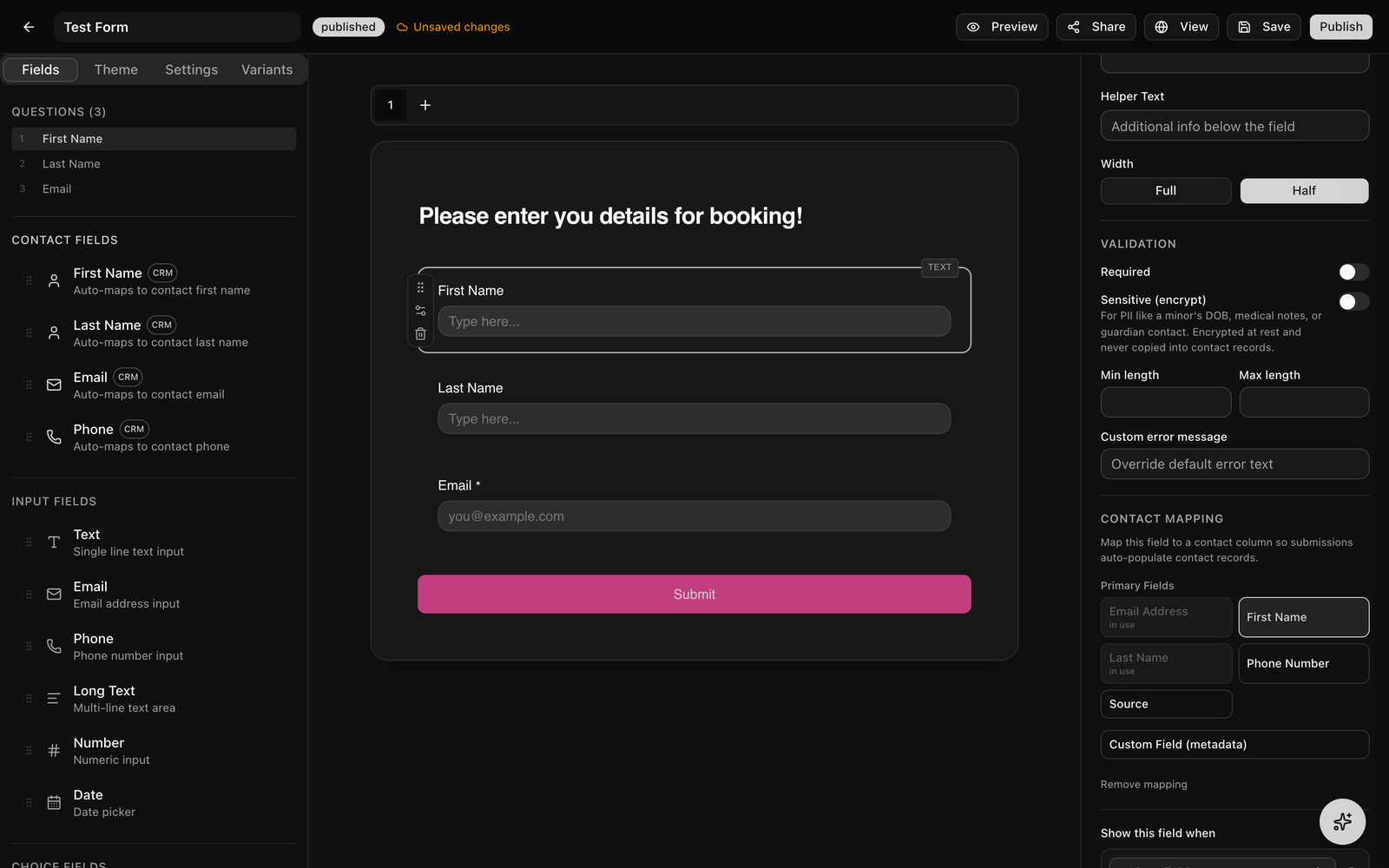
Selecting a field opens the Field Settings panel on the right. Depending on the field type you can set:
- Required, make the field mandatory (an asterisk shows unless you turn it off in Theme).
- Placeholder & helper text, hint text and a description below the field.
- Width, Full or Half, so two fields can sit side by side in a two-column row.
- Validation, min/max length (text), min/max value (number), a regex pattern, and a custom error message.
- Sensitive (encrypt), see Sensitive Data below.
Conditional Field Visibility
Show or hide a field based on answers to other fields, so the form branches with the respondent's input.
- Select the field you want to show conditionally and scroll to the Field Settings panel.
- Under Conditional Visibility, click to add your first rule.
- Choose the source field whose answer should be checked.
- Pick an operator:
equals,not_equals,contains,not_empty, oris_empty. (Thenot_emptyandis_emptyoperators need no comparison value.) - Add more rules and choose whether ALL (
and) or ANY (or) must match.
The rule evaluates live, the field appears or disappears instantly in both the builder preview and the published form.
Hidden Fields & URL Prefill
A Hidden field captures a value without showing an input. Use it to stamp every submission with context or to read a value out of the page URL:
- Default value, a static value baked into the form (for example an event or campaign ID).
- Prefill from URL, name a query parameter (for example
event_id) and the field reads it from the link, so/form/your-form?event_id=abc123capturesabc123.
Like any field, a hidden field can be routed to a contact column or a metadata key.
Email Confirmation Field
Any Email field can require a second "confirm your email" input. Turn on Require confirmation in its settings (and optionally set the confirmation label); the form will not advance until both entries match.
Address Field
The Address field collects a full postal address with configurable subfields, street, city, state, zip, and country, and maps to a contact metadata key.
Image Upload vs. Image Block
- Image Upload lets the respondent upload one or more images, with a per-file size cap you set (in MB).
- Image (block) displays an image you place in the form, with a caption, alignment, and size, it is content, not an input.
E-Signatures
The Signature field captures a legally meaningful electronic signature the respondent either types or draws.
- Consent text, the statement the signer attests to (for example a waiver or permission-slip language).
- Guardian / minor consent, turn on "require guardian" to ask "I am the parent/legal guardian" and capture the minor's name.
On submit, Modality writes an auditable Signature record (ESIGN/UETA): the signer's identity and intent, the IP address and user agent, and a SHA-256 hash of the signed content for tamper evidence.
Reservations & Booking
The Reservation field lets a respondent book a time slot on one of your bookable Spaces right inside the form.
- Add a Reservation field and pick the Space whose availability it should offer.
- Optionally require a party size and set a maximum. The public field shows a day picker and the Space's open slots for the chosen date.
- On submit, the reservation is created against the Space and linked to the submission, it appears on the venue booking calendar.
If the Space requires a deposit, the deposit is charged after an operator accepts the request (deposit-on-accept), not at submission time. When the Space requires a signed contract, the deposit link is withheld until the contract envelope is completed (sign-then-pay gating).
Payments & Checkout
To take payment, add a Products field and list your items with prices. A Products field supports single or multiple selection, optional quantities, and (for scheduled menus) a list or calendar layout. Prices are entered in dollars and stored in cents.
Enabling Payments
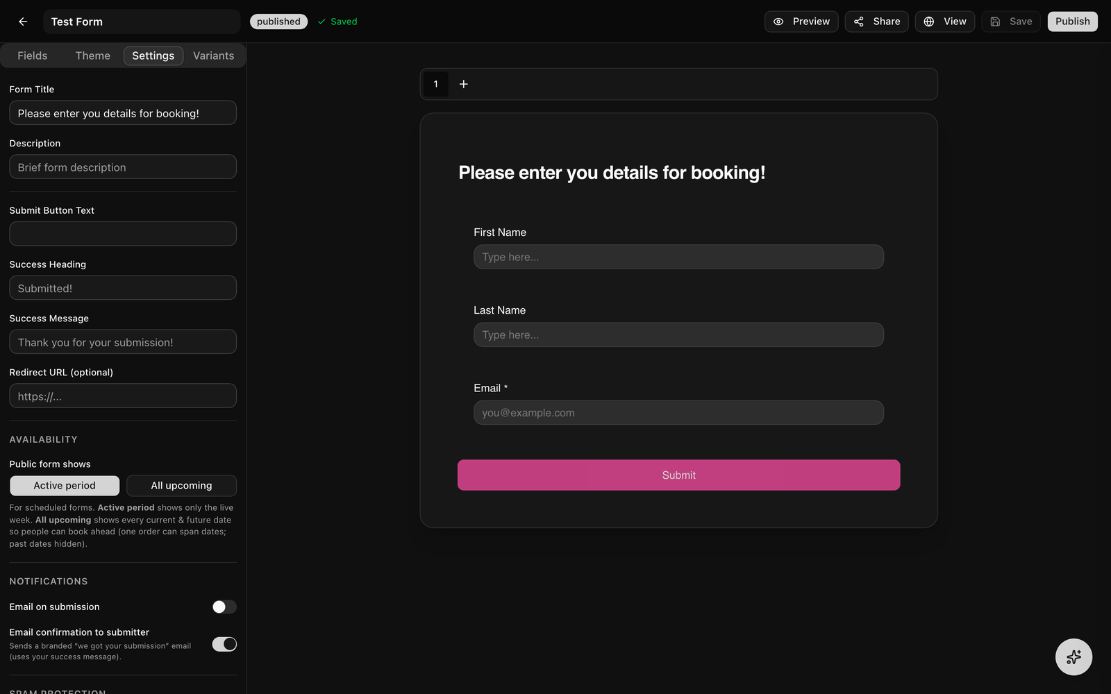
Once a form has a Products field, a Payments section appears in the Settings tab. Turn on Enable payments, then choose:
- Payment timing, Collect on submission (the submitter is sent straight to Stripe Checkout) or Collect manually (record the submission now and send a pay link later from the Submissions table).
- Currency, USD, EUR, GBP, or CAD.
- Collect billing address, require an address at checkout.
Stripe Connect Payouts & Fees
Customer payments always route to your workspace's connected Stripe account, your business shows on the checkout and you receive the funds, while Modality takes its cut as a Stripe application fee. If you have not connected Stripe, payment is refused rather than routed to the platform (you will see a "payments not connected" error), so connect Stripe in Settings before publishing a paid form.
Routing Submissions to Your CRM
Every submission can create or update records automatically. This runs on two layers: contact mapping (People) and optional multi-object routing.
Contact Mapping (People)
- The Contact Fields in the palette (First Name, Last Name, Email, Phone) are pre-mapped to People columns. Any other field can be mapped to a metadata (custom) field.
- On submit, Modality upserts a person by email: an existing person is updated, otherwise a new one is created. First-touch source is captured.
- Metadata-mapped fields are also auto-registered as workspace custom-field definitions so they show up as real columns.
- The form's Settings tab can auto-tag and auto-add to a list every person who submits.
Linked Record Types (multi-object routing)
When a form targets a custom object, you can also route specific fields into additional objects, for example, extract name and email into People while creating an Application record. In the Settings tab's Linked Record Types section, for each linked type you choose:
- Upsert by, an identity attribute (email/text/phone) used to find and update an existing record, or "always create new."
- When record exists, overwrite all fields, or only fill empty ones.
- Field mapping, which form field feeds which attribute on the target. Fields routed to a linked type are excluded from the primary record.
Records are linked by their relationship attributes, and submissions from a Product Set tied to an event can stamp that event onto the routed record automatically.
Sensitive Data / PII
Mark any field Sensitive (encrypt) in its settings for data like a minor's date of birth, medical notes, or guardian contact. A sensitive field is:
- Encrypted at rest (AES-256-GCM) in the stored submission, and decrypted only for authorized display and export.
- Never mapped to a Contact or record as plaintext, it is excluded from CRM routing entirely.
Workspaces with an "encrypt everything" policy encrypt every field value on every submission automatically.
Emails & Notifications
- Confirmation to the submitter, on by default, a branded "we got your submission" email (using your success message). Toggle it off in the Settings tab.
- Notification to your team, turn on "Email on submission" and enter an address to be notified each time the form is submitted.
Anti-Spam & Verification
- CAPTCHA, enable Cloudflare Turnstile to block spam submissions.
- Require email verification, the respondent must confirm their email with a 6-digit code before the form can be submitted.
Automations & Webhooks on Submit
A submission is an event other systems can react to:
- Automations, a submission fires the
form_submittedtrigger, so you can send emails, create invoices, or add the person to an event. - Webhooks, a
form.submittedwebhook is dispatched with the submission, form, and contact IDs, so external systems can be notified in real time.
Form Experience & Theming
Experience mode
On the Theme tab, choose how the form is presented:
- Classic, all fields on the page (paged if you add pages).
- One at a time, a guided flow that presents one question per screen.
GIF: filling out a published form set to the 'one at a time' experience, one question per screen, advancing through the flow.
Demo GIF / screenshot to be added
Visual theming
The Theme tab controls the look of the form:
- Colors, background, accent (active), text, and warning colors, each a single solid color.
- Fonts, a primary and secondary font from roughly 70 Google Fonts (or a brand-kit font), previewed live.
- Field appearance, corner radius (none through full), style (outline, filled, or underline), and depth (flat or raised); plus a toggle for the required asterisk.
- Submit button, its own background and text color, radius, font family and weight, size, and width (fit-to-label or full-width).
- Header, a cover/header image, title, description, and alignment, set on the header block at the top of the canvas.
Multi-page forms
- Add a page with the + button in the page tabs above the canvas (there is no "page break" field).
- Click a page tab to switch to it; new fields land on the page you are viewing.
- Rename a page by editing its tab; drag fields between pages via reorder.
- On the published form, respondents move with Next/Previous and see a progress indicator.
Product Sets & Scheduling
The Variants tab lets one form serve many events or time windows without cloning it. There are two coexisting models.
Product Sets (link-based)
A product set reuses the same fields and theme but carries its own products, prices, and its own public link at /form/<set-slug>. Create a set, edit its items in the dialog, and optionally link it to an event so each entry is priced from that set and routed to the right event. Give each event its own set and hand out its link, one form, many priced menus.
Scheduled menus (date-based)
For recurring menus, the schedule planner creates dated variants with active-from / active-to windows and an optional order cutoff. One stable bookmark always serves the live week, and you can duplicate a week to the next. In the Settings tab, the Availability control chooses what the stable URL shows:
- Active period, only the variant whose window contains now (the live week).
- All upcoming, every current and future date aggregated (past days hidden) so people can order or book ahead across dates in one submission.
Once a variant's order cutoff passes, its ordering closes and the server rejects late submissions.
Managing Submissions
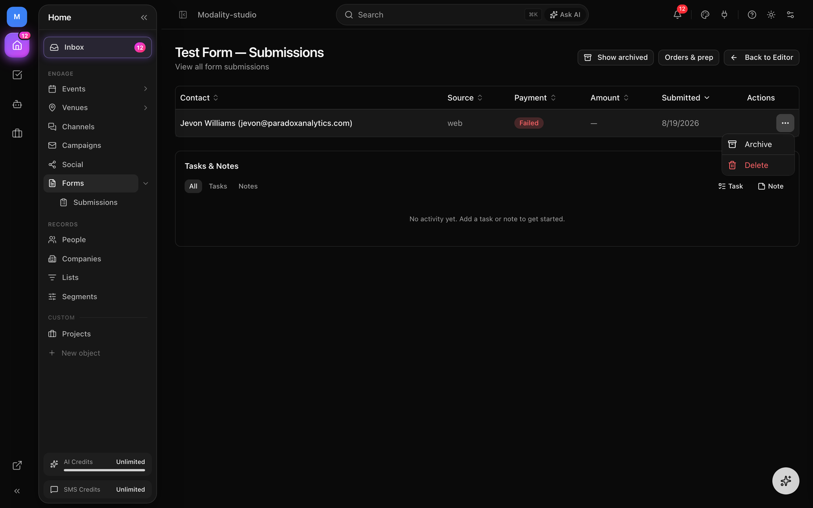
Open a form and go to Submissions to see everything it has collected. The table gives you:
- Payment status badges and the amount, with sortable columns (date, payment status, amount).
- Resend a pay link, for a submission awaiting payment or with a failed payment, copy or resend its Stripe pay link.
- Archive / restore, hide a submission from the default list (and bring it back). Old submissions auto-archive after 90 days, but never while a payment is still in flight.
- Delete, permanently remove a submission.
- Activity feed, a per-form record of activity.
Orders & Prep Report
For product or food forms, open a form and go to Orders for an operational report with two views:
- Prep, totals per item across all orders, split into paid and unpaid quantities, so the kitchen or fulfillment team knows exactly how much to make.
- Roster, one row per order with the buyer, their items, quantity, and paid status.
For scheduled forms you can filter the report to a single variant (for example this week's menu).
Screenshot: the Orders report for a product form, the Prep view showing per-item totals with paid/unpaid quantities, and the variant filter selecting one week's menu.
Demo GIF / screenshot to be added
Publishing & Sharing
Publishing a form
- Click Publish in the top-right of the toolbar. The status changes from Draft to Published.
- A public page goes live at
/form/your-form-slug. A View button appears in the toolbar to open it. - Keep editing after publishing, the builder auto-saves and the public page reflects changes immediately.
?ws=<workspace-slug> parameter. The Share dialog and payment return URLs add this automatically, use the links it gives you rather than a hand-built /form/slug, which could otherwise resolve a different tenant's form.Sharing & embedding
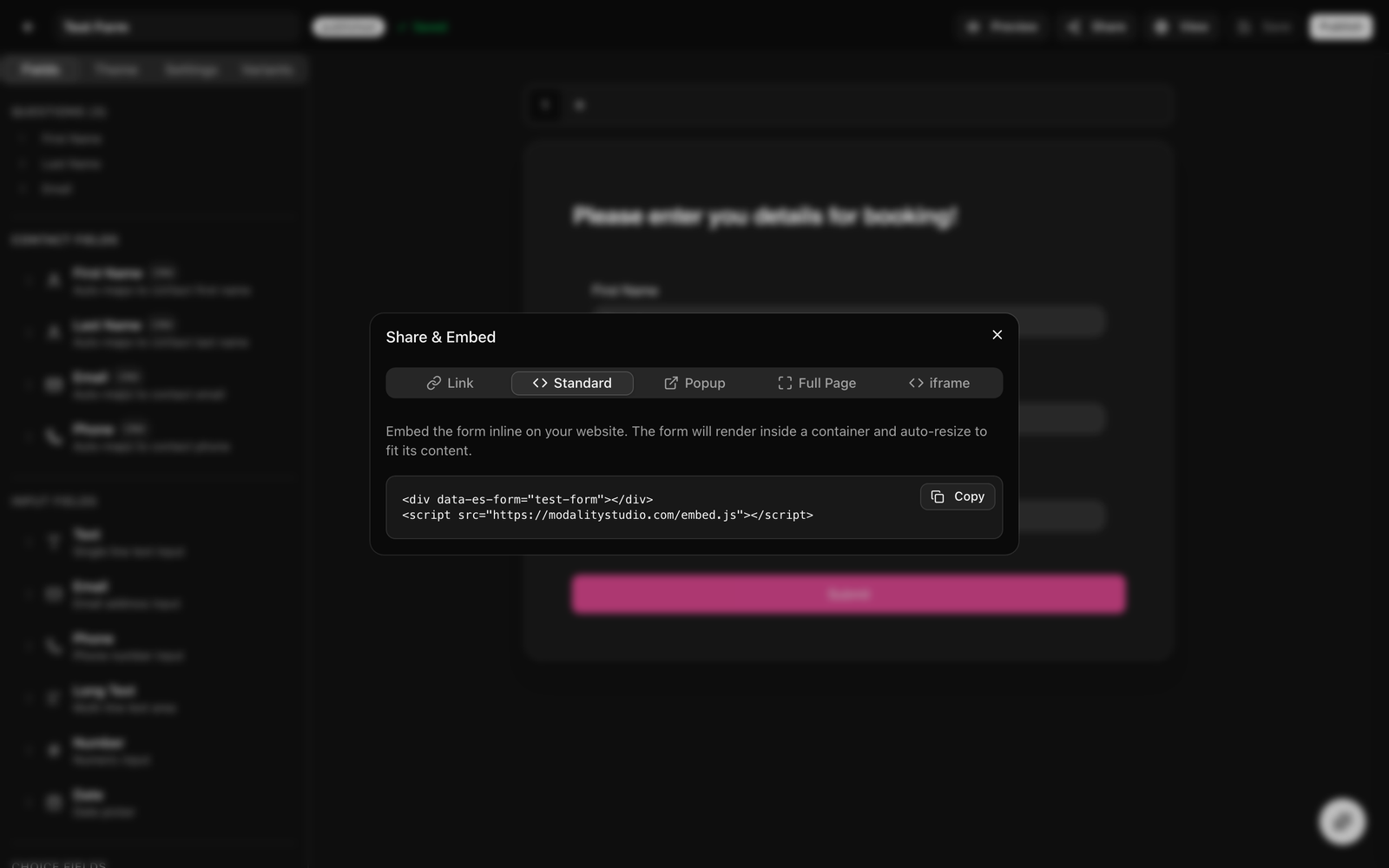
Click Share in the toolbar to open the Share & Embed dialog. If the form has product sets, a version selector lets you share the base form or any set. There are five tabs:
- Link, the direct public URL (with the workspace scope) to send by email, social, or messaging.
- Standard, an inline embed: a
<div data-es-form>plus theembed.jsscript. The form renders in place and auto-resizes to its content. - Popup, a button (with custom text) that opens the form in an overlay when clicked.
- Full Page, the form takes over the whole page, like a standalone hosted form.
- iframe, a raw iframe with width/height you set, for advanced cases.