Brand Kit
Define your brand once and reuse it everywhere. The Brand Kit stores your colors, typography, voice, guidelines, organizer identity, social links, and logo/asset library, and feeds them as defaults into event pages, forms, email campaigns, invoices, and AI-generated content so every touchpoint stays on-brand.
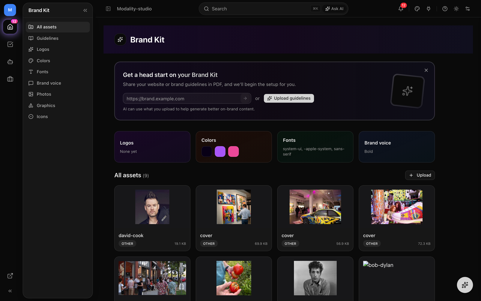
Where the Brand Kit Lives
Open Brand Kit from the sidebar. A left rail organizes everything into sections you can jump between:
- All assets, an overview with category cards and your full asset library.
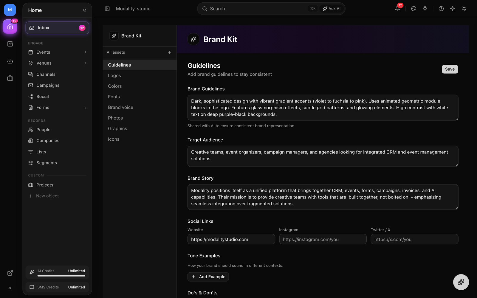
- Guidelines, brand guidelines, story, target audience, tone examples, and do's & don'ts.
- Logos, your logo files, with the ability to set an active logo.
- Colors, your brand color palette.
- Fonts, your brand font family, previewed across typographic roles.
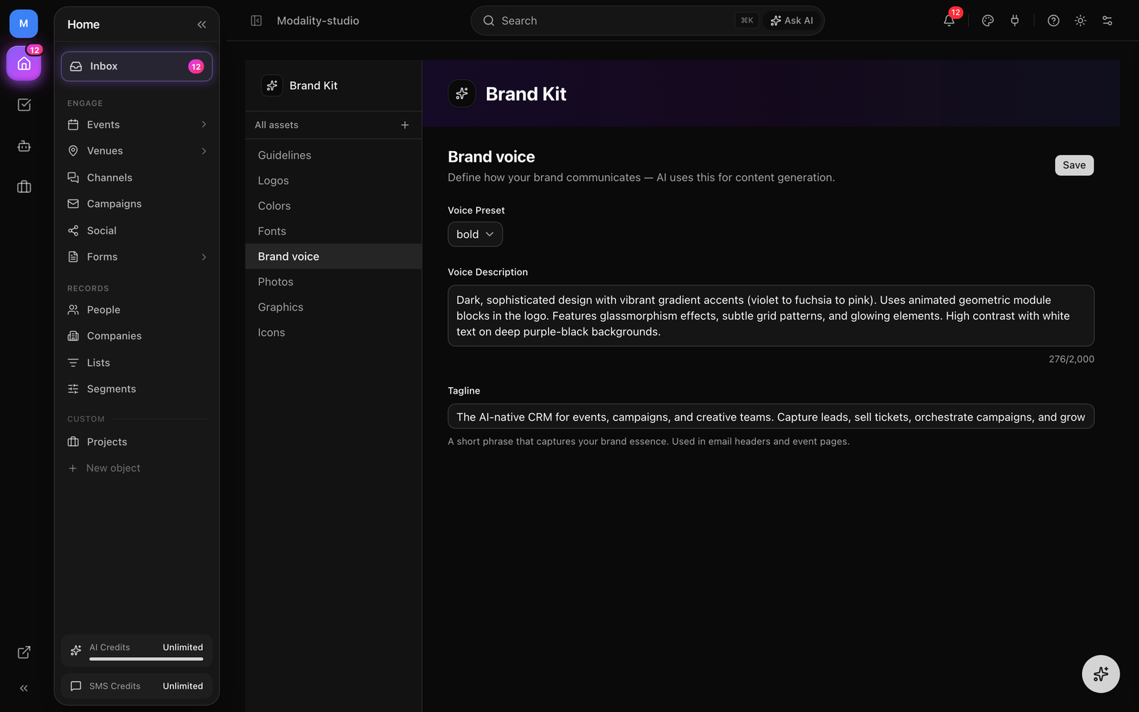
- Brand voice, voice preset, voice description, and tagline.
- Photos, Graphics, Icons, categorized asset libraries.
Most sections have their own Save button, so you can edit and persist one area at a time. From the All assets view you'll also see the AI head-start banner (below) and, once a color, font, or logo is set, the Apply Brand Kit Across Workspace card.
Get a Head Start with AI
If you already have a website or a brand guidelines document, let AI populate the Brand Kit for you. The head-start banner on the All assets view offers two paths.
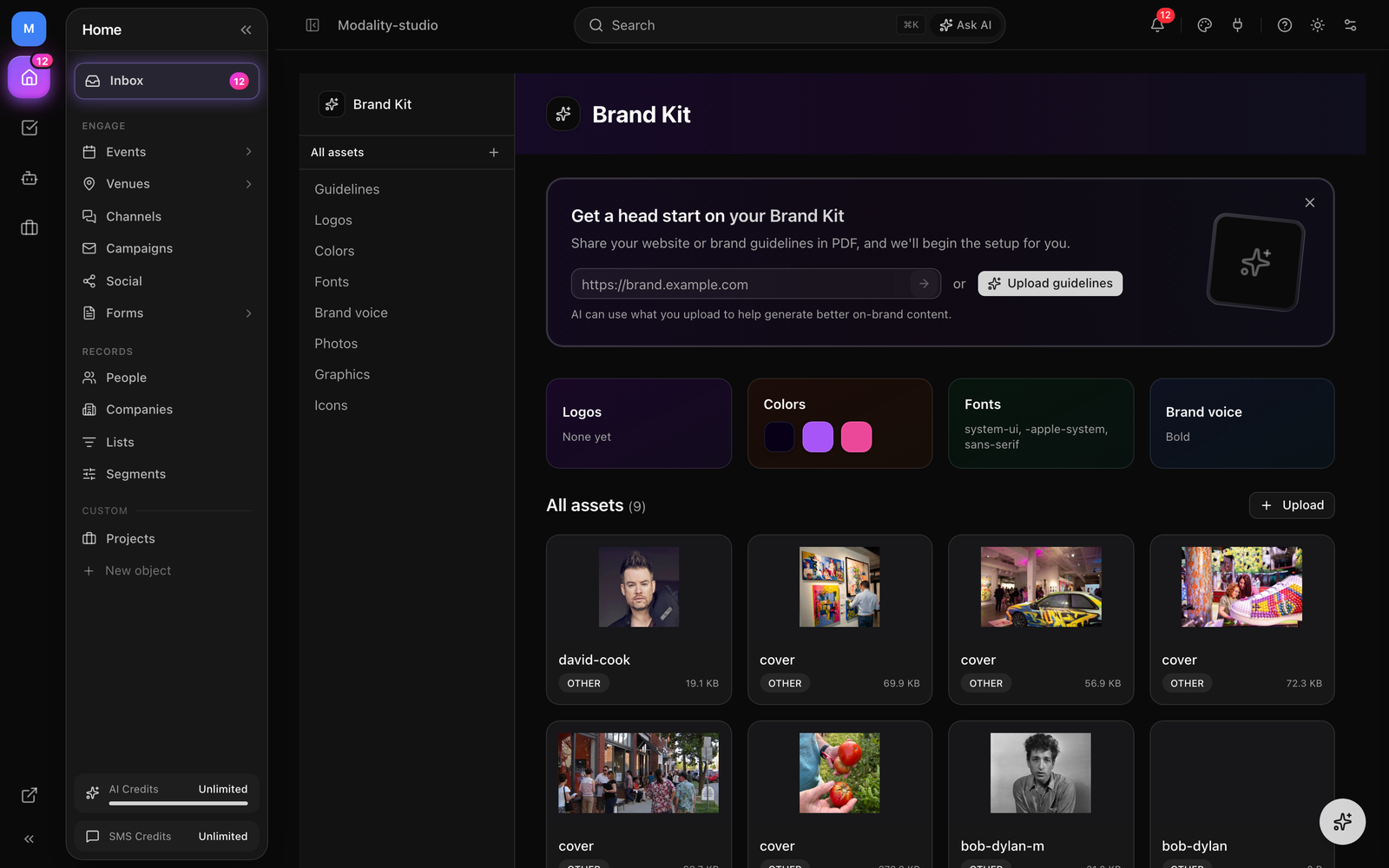
Extract from a Website
- 1
Enter your website URL
Paste your site URL into the banner field (you can omit
https://, it's added automatically) and submit. - 2
AI analyzes your site
AI reads the page and infers your colors (primary, secondary, accent), a real font-family name, logo, tagline, a voice preset, target audience, brand story, and social links.
- 3
Results are merged and saved
The extracted values are merged into your existing Brand Kit and saved automatically, nothing is overwritten silently that you can't re-edit. Adjust anything by hand afterward in the relevant section.
Upload Brand Guidelines
Prefer to start from a document? Click Upload guidelines and pick a .pdf, .txt, .md, .doc, or .docx file. AI extracts colors, font, tagline, voice preset, target audience, and brand story, then merges and saves them the same way.
Brand Colors
The Brand Kit tracks seven color roles. Each is a 6-digit hex value (e.g. #6366F1); any value that isn't a valid hex is dropped rather than blocking the rest of your save.
- Primary, your main brand color, used for CTA buttons and headings.
- Secondary, a supporting color for secondary elements.
- Accent, a vibrant highlight for active states, focus rings, and small accents.
- Nav Bar, the color for navigation bars on event and organizer pages.
- Background, the page background on public event and organizer pages.
- Text, the base text color on those pages.
- Button text, the text color on primary CTA buttons (defaults to white).
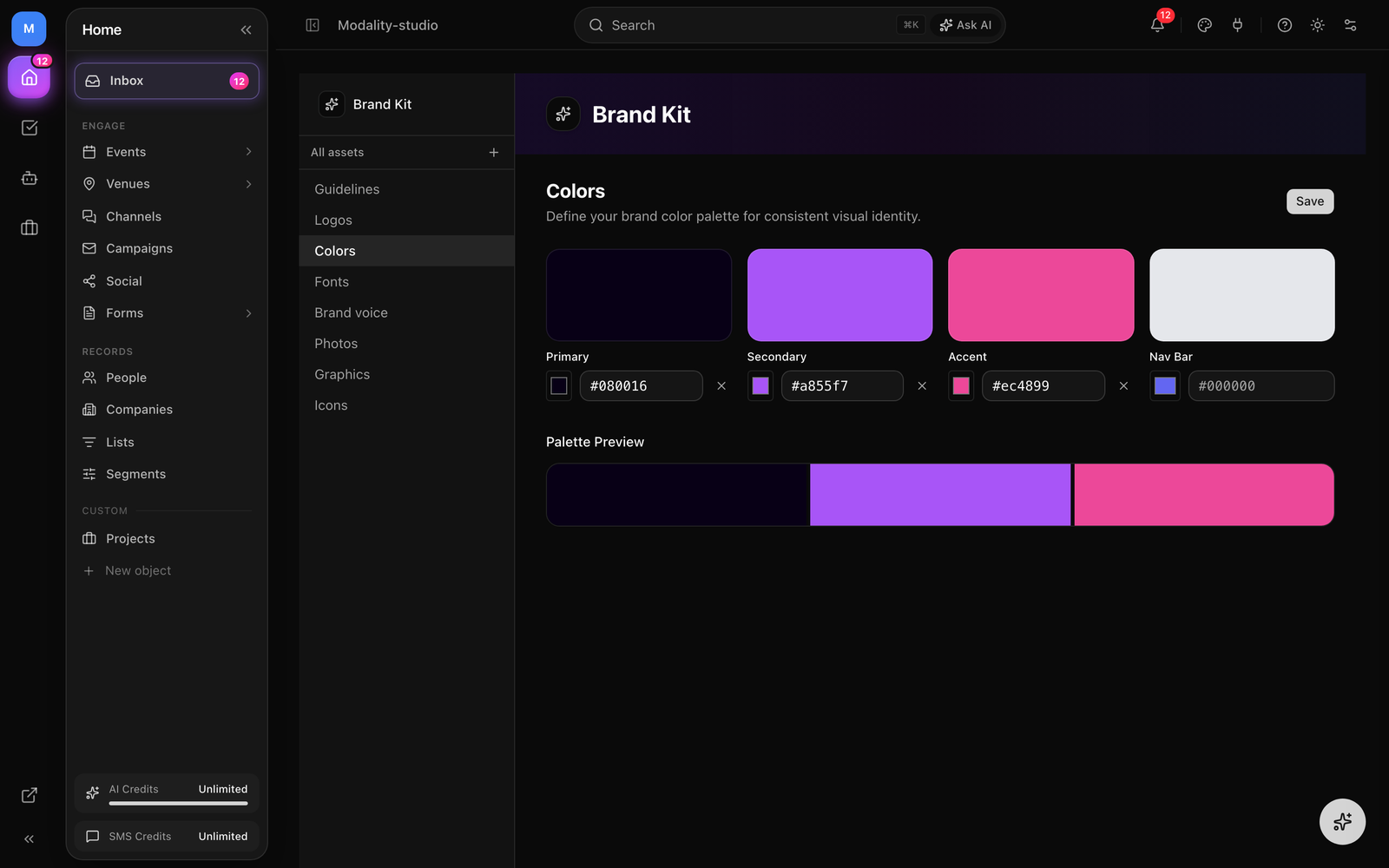
The Colors section exposes swatches for Primary, Secondary, Accent, and Nav Bar, with a live palette-preview strip. The three page-surface roles, Background, Text, and Button text, are applied on public pages and are edited (with a "Use brand kit" shortcut) in each page's Theme tab in the event and organizer page editors; AI website/PDF extraction can also populate them.
How to Set Brand Colors
- Open the Colors section in the Brand Kit sidebar.
- Click a color tile (or its native color input) to open the picker, or type a hex code directly.
- Use the Palette Preview strip below to check the colors together; clear any role with the × button.
- Click Save. Your colors become the defaults for new events, forms, email campaigns, and invoices.
Typography
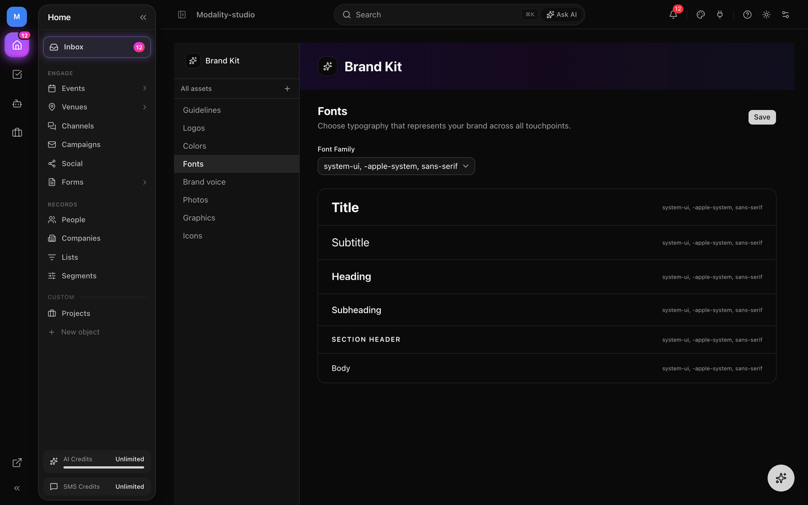
Pick one brand Font Family from a searchable list of more than 60 Google Fonts (plus a System Default option). The chosen font loads live so you can see it applied across six typographic roles in a live preview:
- Title, the largest, boldest display size.
- Subtitle, a large supporting line under a title.
- Heading, semibold section headings.
- Subheading, medium-weight secondary headings.
- Section header, small, uppercase, wide-tracked labels.
- Body, running body copy.
Selecting a font updates every role preview at once. Opaque values (such as an Adobe Typekit kit id) are treated as "no font selected" so they're never shown or loaded as a Google Font. Your brand font flows into event pages, forms, email campaigns, and AI-generated content.
Brand Voice
Tell AI how your brand should sound. The Brand voice section has three parts:
- Voice preset, choose one of five presets: Professional, Casual, Luxury, Bold, or Playful.
- Voice description, a free-text field (up to 2,000 characters) to describe your brand's personality, e.g. "our voice is confident, casual, and friendly."
- Tagline, a short phrase (up to 200 characters) that captures your brand essence; used in email headers and on event pages.
Guidelines & Extended Brand Identity
The Guidelines section captures the richer context AI uses to stay consistent. Everything here is optional, and each field is shared with AI when it drafts content:
- Brand Guidelines, your visual and communication standards (up to 2,000 characters).
- Target Audience, a description of your ideal customer or attendee (up to 1,000 characters).
- Brand Story, the origin and mission behind your brand (up to 2,000 characters).
- Tone Examples, up to 10 context/example pairs (e.g. context "Event invite" with a matching line of example copy) showing how your brand should sound in different situations.
- Do's & Don'ts, two lists (up to 10 each) of things to do (e.g. "Use active, energetic language") and to avoid (e.g. "Avoid corporate jargon").
The Guidelines section also includes a compact Social Links block (Website, Instagram, and Twitter / X), the full set of social fields is covered below.
Organizer Identity
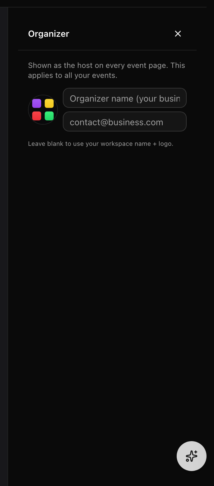
Your Brand Kit carries an organizer identity that appears in the Organizer section of public event and organizer pages:
- Organizer name, the business or host name shown to guests.
- Organizer email, a contact address for the organizer (lenient free text, so a stray typo never blocks the rest of your save).
- Organizer photo, an avatar/logo image for the organizer.
When any of these are unset, pages fall back to your workspace name and brand logo (and finally the owner's account). You edit the organizer identity from the Organizer panel in the event editor and in the organizer page editor, where it saves back to your workspace branding.
Social Links
The Brand Kit stores links for up to six networks, surfaced on your public pages:
- Website
- Twitter / X
- TikTok
- YouTube
Links are lenient free text, you can enter a bare domain like yoursite.com without a protocol, and the render side normalizes it to https:// automatically. The full six-field set lives in the workspace Settings → Brand Kit tab; the Guidelines section offers a quick three-field subset (Website, Instagram, Twitter / X).
Logos & Asset Library
The Brand Kit doubles as a shared asset library. Upload images and organize them by category so they're one click away in the email editor, event pages, and AI Campaign Studio.
Uploading Assets
- Open a category section (Logos, Photos, Graphics, or Icons), or use the + next to "All assets" in the sidebar.
- Click Upload (or the + button) to pick files, or drag and drop images directly onto the section.
- Uploads land in that section's category. You can re-categorize any asset later.
- Hover an asset to Copy URL, edit it, or delete it.
Asset Categories
Assets are grouped into Logos, Photos, Graphics, and Icons (with additional categories, Headers, Inline, Backgrounds, Social, Other, available when editing an asset). Each section shows a live count, and the All assets view rolls them up into category cards.
Setting Your Logo
In the Logos section, click Set as logo on any asset to make it your active brand logo, the current one is marked with an Active Logo badge. You can also paste a logo URL directly in the Settings → Brand Kit tab. Your logo appears in email campaign headers, published form headers, event pages, and AI-generated content.
Editing an Asset
Click the pencil on an asset to open the edit dialog, where you can rename it, change its category, and add alt text for accessibility.
Screenshot: the asset library grid with a logo card hovered, the Copy URL / edit / delete overlay, the 'Set as logo' action, and the 'Active Logo' badge on the current logo.
Demo GIF / screenshot to be added
Applying Your Brand Kit
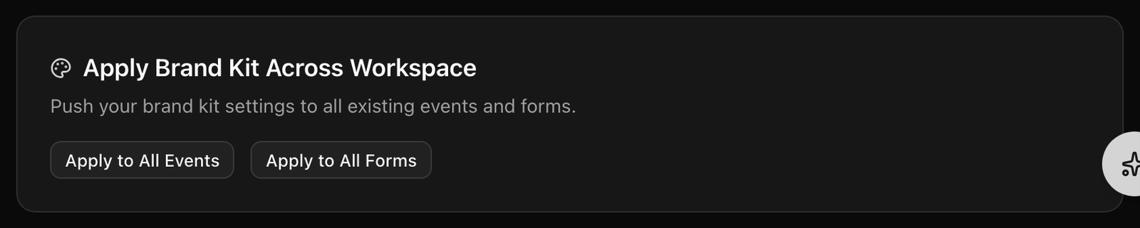
Your Brand Kit is automatically used as the default when you create new content, new events, forms, email campaigns, and invoices all inherit your colors, fonts, and logo. To push updates onto content you already created, use Apply Brand Kit Across Workspace (shown on the All assets view once a color, font, or logo is set):
- Apply to All Events, pushes your accent color, nav color, font family, and logo onto every event's settings.
- Apply to All Forms, pushes your font family and accent color into every form's theme.
Each action reports how many items it updated. Event and organizer page editors also offer per-page "Use brand kit" shortcuts to pull in individual values (like background or text color) without changing your global defaults.
Invoice Branding
The Brand Kit flows through the entire invoicing experience:
- Invoice emails, your logo appears in the header, brand colors style the email, and brand fonts are used for typography.
- Public payment pages, the customer-facing page displays your logo and applies brand colors and fonts to buttons and accents.
- Email templates, the invoice email template editor includes brand color swatches and font options.